
SMHI Weather App Redesign
Team Size
Solo
Role
UI Designer
Duration
1 week(s)
Tools
Figma, Photoshop
Style Guide
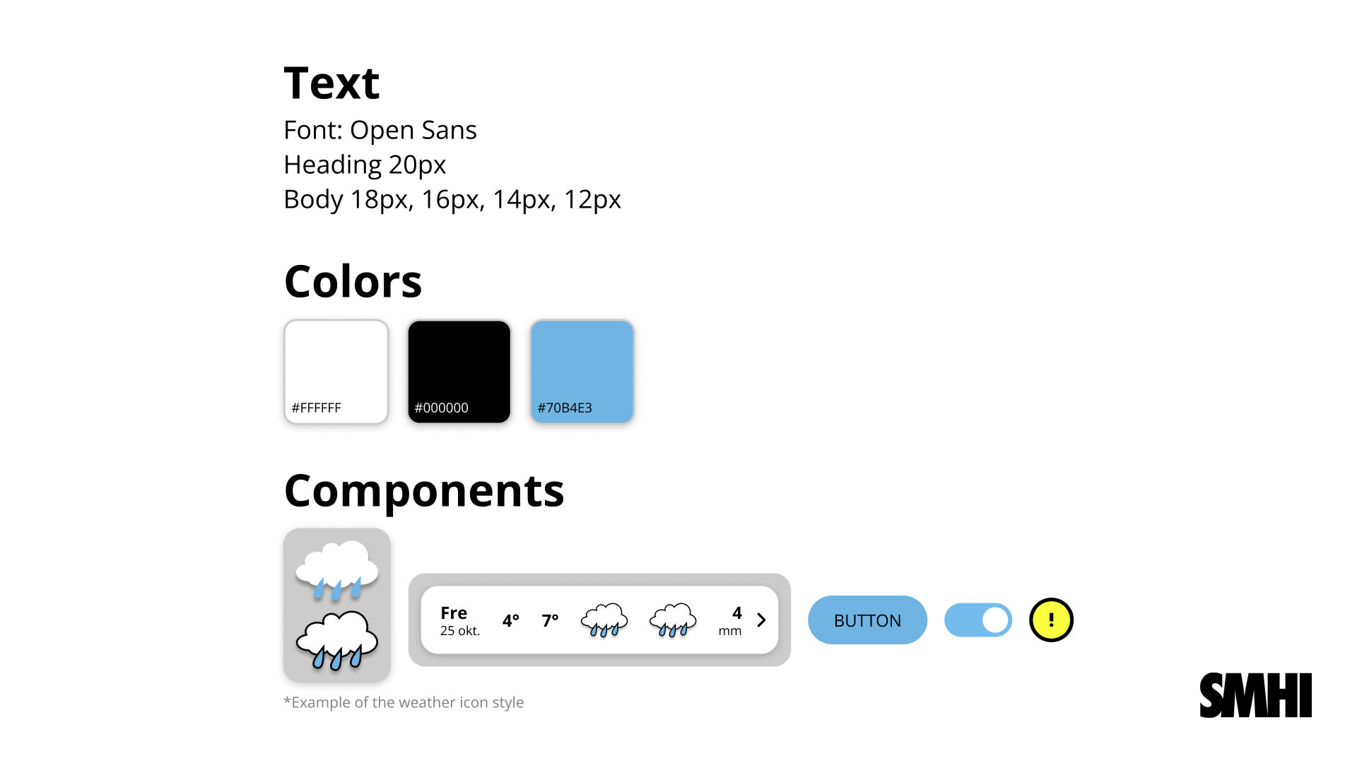
Goal
The goal with this project was to redesign the Swedish SMHI's weather app, giving it a new look and removing bloat such as removing nested pages.
Concept to Design
The main features of the app are as follows below:
(1.) Start (Today's weather and following 10 days),
(2.) Diagram (Fluctuation in temperature and weather visualized),
(3.) Map (Different weather conditions visualized on a map),
(4.) Weather Warnings (Warnings around your location and rest of Sweden).
A gripe I have with the official design is the lack of convenience of information on the start page
- you only get to see the weather of today and tomorrow at an hourly basis.
In my redesign, the next 10 days' weather is on the start page, now the diagram is on it's own page - less nested pages.
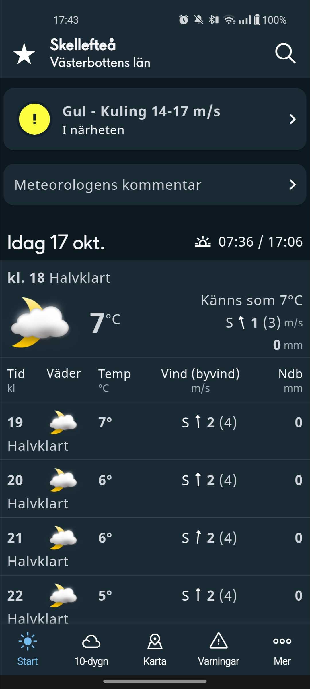
Official
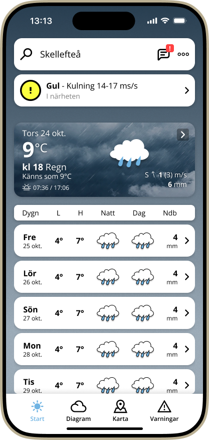
Redesign
Design Gallery
An overview of all the redesigned pages. You can try the Figma prototype (link at top).

Start
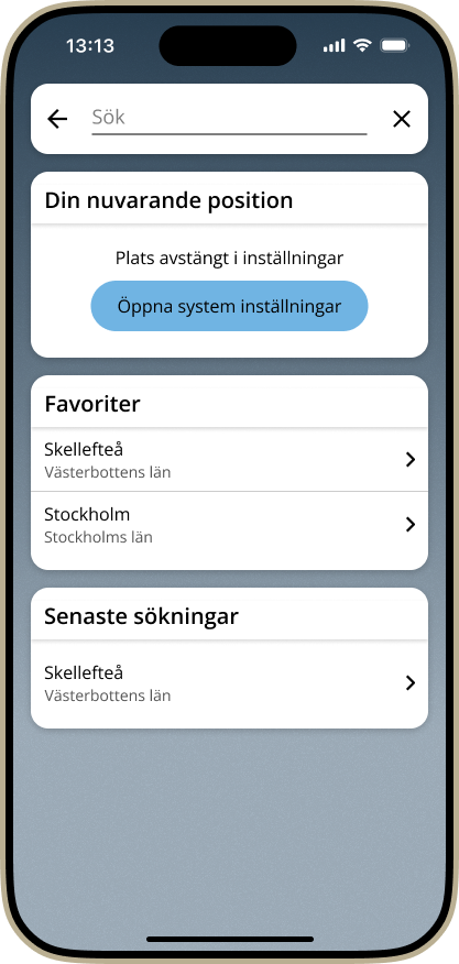
Search
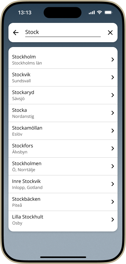
Search Result
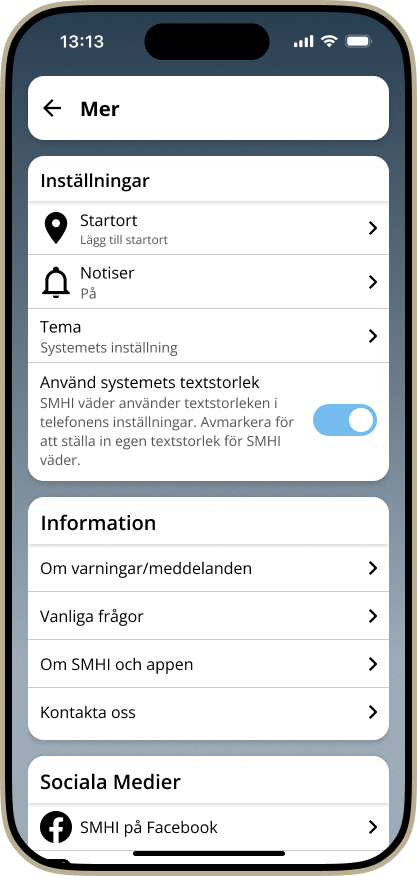
Settings
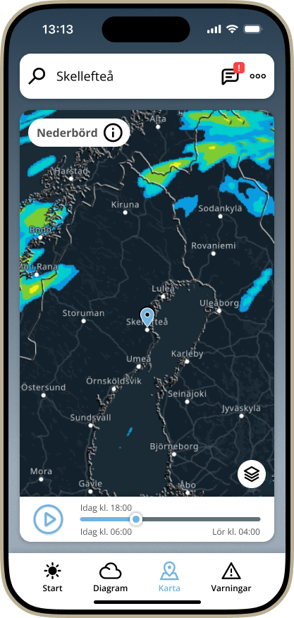
Map
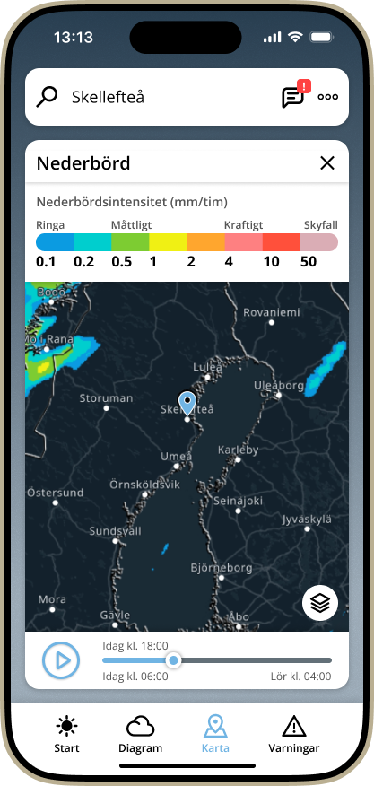
Map Precipitation
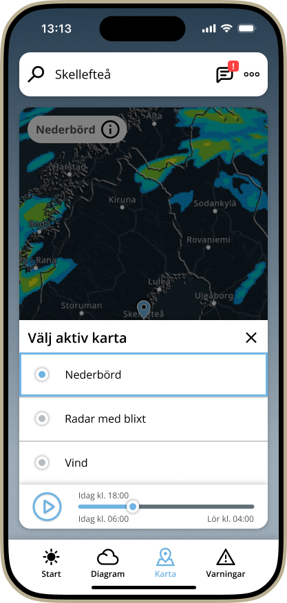
Map Weather Filter

Weather Comment
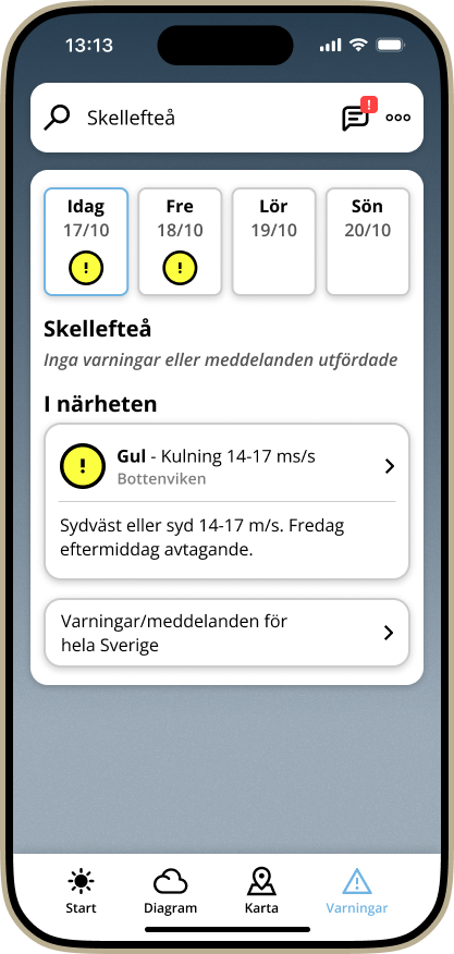
Warnings - Location
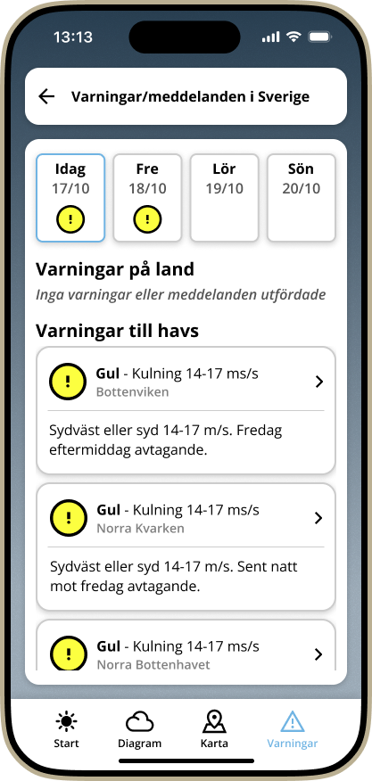
Warnings - Sweden
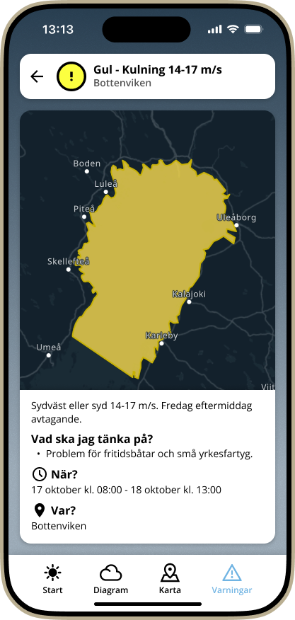
Warning Map
Takeaways
I discovered that the official design has a problem with nested pages, and therefore became the biggest difference in design.
How can you show the user information in a cheaper way?
For example, by showing the 10-day weather on the start page,
instead of a separate page, the user gets relevant information faster at convenience.